.png)


Data. Art. Exhibition
Conférences + Masterclass


WELCOME WELCOME WELCOME WELCOME WELCOME WELCOME WELCOME WELCOME WELCOME WELCOME WELCOME WELCOME WELCOME WELCOME WELCOME WELCOME WELCOME WELCOME WELCOME WELCOME WELCOME WELCOME WELCOME
QUESTIONS
Pourquoi certaines data visualisations nous marquent-elles plus que d’autres ?
Qu’est-ce qui fait qu’une donnée devient mémorable,
et impactante ?
Entre pratiques simples et dispositifs plus élaborés, il existe différentes manières de faire parler les données. Des réseaux sociaux jusqu’aux expositions, c’est toute une démarche de médiation qui permet de rendre ces visualisations accessibles et de donner au public les clés pour s’approprier les données et les sujets qu’elles révèlent.
nos dernieres interventions
Big Bang Dataviz
Quand l'art rencontre les données
ECOLE W
2024 // PARIS
Montrer aux étudiants à quel point il n'a jamais été aussi important, dans une ère des données et du big data, de rendre lisibles, attractives et même esthétiques ces données ! C'est la mission même de la datavisualisation, qui de simple mise en forme graphique et visuelle des données, a pris de plus en plus d'ampleur, au point de devenir, à la fois une forme d'art mais aussi un outil marketing et communication pour les entreprises qui l'utilisent pour "faire parler et donner à voir" leurs chiffres, leurs flux, leurs statistiques. Le journalisme de données sera mentionné pour les élèves en journalisme. Et la Masterclass sera agrémentée d'un petit atelier pratique pour que les étudiants s'approprient la discipline.
Dans le cadre du Bachelor spécialisé en luxe, mode et art de l'École W, Masterclass et Workshop auprès des étudiants en communication, marketing et journalisme.
Données à voir
Quand le design éclaire la data
INSTITUT PARIS REGION
2023// PARIS
Qu’est-ce que la data visualisation peut apporter aux décideurs publics et constituer un atout pour une meilleure compréhension de leur territoire ? Animation du parti-pris par Marthe Viallet : commissaire d’exposition de datavisualisation. Avec : Caroline Goulard (cofondatrice de Dataveyes) Laurie Gobled (directrice du département des systèmes d'information à L'Institut Paris Region) Dario Ingiusto (responsable adjoint de l’infographie journal Le Figaro) Nicolas Mondon (en charge des infographies au journal Le Figaro) Thomas Watkin (maître de conférences en design urbain et sociologie à l’Université de Nîmes).
L'Institut coorganise avec la Région Île-de-France et avec la participation d'Île-de-France Mobilités la première semaine francilienne de la donnée du 26 au 29.09.2023.
La dataviz outil de médiation ?
Entres les données brutes et le public
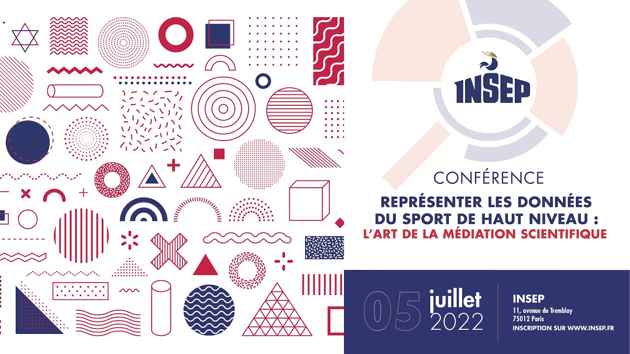
INSTITUT NATIONAL DU SPORT [ INSEP ]
2022// PARIS
Qu’est-ce qui justifie de faire des data visualisations impactantes ? Quels sont les ressorts des data visualisations réussies ? Il existe des pratiques simples pour faire parler les données jusqu’aux dispositifs plus poussés Des réseaux sociaux jusqu'aux expositions, une démarche de médiation autour des données permet au grand public de s’approprier l’objet dataviz et le sujet traité. Introduction de la conférence : Fabien Canu, Directeur Général de l'INSEP Bertrand Daille, Chef du Pôle Performance Jeremy Wanner, Data-scientist, Pôle Performance Autres intervenants : Artur Galocha (Graphics editors, The Washington post) Julie Brunet (Data & information designer, Datacitron)
Journée de conférences à l'INSEP.
Représenter les données du sport de haut niveau : L'art de la médiation scientifique
Data & design
Qui aura le dernier mot ?
Avec Florian Melki, data analyst
SALON DE LA DATA ET DE L'IA
2022// NANTES
Que serait une représentation de données dépourvue d’une couche de design pour la rendre compréhensible et accessible, sinon un outil technique probablement peu utilisable ? Que serait une représentation de données dépourvue d’un grand nombre de données sinon une simple infographie ? En combinant le meilleur de leurs mondes respectifs, Florian Melki, data analyst, vous raconte comment sa rencontre avec Marthe Viallet, data designer, les a menés à co-construire des projets de dataviz, interroger leurs pratiques, et même se lancer dans la conception d’expositions de data visualisation.
Salon pour tout professionnel de la Data et de l’IA qu’il soit décideur, expert ou utilisateur. Retours d’expériences et informations sur les avancées actuelles sur les usage et enjeux de la donnée.
Data design
et data journalisme
Apprentissage et Inspiration
DGFIP - Délégation à la transformation numérique
2022 // PARIS
En quoi le design des données est nécessaire ? En quoi les data journalistes peuvent nous inspirer ? Quels sont les ressorts des dataviz réussies ? Quels sont les meilleurs choix de design en data visualisation : polices d'écriture et couleur ? Comment stimuler l'engagement et l'attention du lecteur, en nous inspirant des data journalistes qui sont des conteurs de données hors pair.
Les Rendez-vous de la Dataviz
Ateliers internes au sein de la DGFIP
Wake up dataviz : Comment faire parler les données ?
Clés pour des
Visualisations Réussies
MEETUP TOULOUSE DATAVIZ
2022 // TOULOUSE
Pourquoi est-il essentiel de créer des visualisations de données marquantes ? Quels sont les secrets des visualisations réussies ? Des méthodes simples aux solutions élaborées, apprenez comment faire parler les données.
Ce groupe est destiné à rassembler tous ceux qui sont intéressés par la data visualisation en créant un lieu d'échange pour comprendre la dataviz, découvrir des réalisations, rassembler des témoignages.
Data & design
Qui aura le dernier mot ?
Avec Florian Melki, data analyst
WEB2DAY
2022 // NANTES
Que serait une représentation de données dépourvue d’une couche de design pour la rendre compréhensible et accessible, sinon un outil technique probablement peu utilisable ? Que serait une représentation de données dépourvue d’un grand nombre de données sinon une simple infographie ? En combinant le meilleur de leurs mondes respectifs, Florian Melki, data analyst, vous raconte comment sa rencontre avec Marthe Viallet, data designer, les a menés à co-construire des projets de dataviz, interroger leurs pratiques, et même se lancer dans la conception d’expositions de data visualisation.
Le Web2day est un festival annuel de l'innovation et du numérique réunissant experts, entrepreneurs et passionnés pour échanger sur les tendances technologiques.
Data visualisation
et complexité
La visualisation des réseaux d'acteurs
MEETUP DATAVIZ PARIS
2020 // PARIS
Comment visualiser les réseaux d'acteurs pour mieux comprendre les dynamiques de collaboration et d'influence ? Quels outils et techniques permettent de cartographier efficacement les parties prenantes ? Explorez les méthodes variées allant de la simple cartographie des relations à des visualisations complexes des réseaux. Découvrez comment ces visualisations peuvent être utilisées pour identifier les acteurs clés, analyser les interactions et optimiser les stratégies de communication et de collaboration.
Le Meetup Dataviz Paris est un événement où passionnés et experts en visualisation de données se rencontrent pour échanger idées et pratiques innovantes.
Des interventions construites, visuelles et portées par un regard singulier sur les données.
Chaque intervention s’appuie sur une sélection de projets et une mise en perspective des pratiques pour proposer une lecture des données à la fois analytique et visuelle.
Aborder les données
à travers différents champs : design, narration, art
et information.
Ces interventions proposent plusieurs points d’entrée pour comprendre, analyser et faire parler les données.
À travers des projets d’artistes et de designers, j’analyse comment les données peuvent être transformées en œuvres, et comment elles peuvent susciter une expérience, une émotion ou un regard nouveau.
Cette approche ouvre un autre rapport aux données : plus libre, plus interprétatif, plus culturel.
This is a paragraph where you can include any information you’d like. It’s an opportunity to tell a story about the company.
Describe a feature you’d like to share about this company or highlight a particular service it offers.
Je présente une sélection de projets marquants qui illustrent différentes manières de traiter, visualiser et raconter des sujets complexes.
Ces exemples permettent de comprendre comment la data visualisation peut devenir un outil éditorial puissant.
Innovations cartographiques

objets visuels de transmission
Chaque intervention s’appuie sur des supports visuels conçus comme de véritables objets éditoriaux.
Ces supports ne sont pas de simples présentations :
ils participent pleinement à l’expérience et à la transmission des idées.
%20(3).png)
informations pratiques
PUBLICS
institutions culturelles
écoles
entreprises
événements professionnels
FORMATS
Conférences et masterclass, généralement sur des formats courts. Chaque intervention est conçue comme un contenu condensé, structuré et directement mobilisable.
Let's Talk!
Conferences

How can we think of data visualization as a tool for mediating between raw data and the public?
Insep 2022 / PARIS

The meeting
between art
and the data
W School 2023 / PARIS

DATA AND DESIGN,
Who will have the last word?
Web2Day
How can we think of data visualization as a tool for mediating between raw data and the public?
Data and AI Fair
How can we think of data visualization as a tool for mediating between raw data and the public?
Institute
Paris Region
How can we think of data visualization as a tool for mediating between raw data and the public?
Meetup Toulouse Dataviz
How can we think of data visualization as a tool for mediating between raw data and the public?
Dtnum/Dgfip
How can we think of data visualization as a tool for mediating between raw data and the public?
Dataviz Paris Meetup
How can we think of data visualization as a tool for mediating between raw data and the public?
?
Testimonials
This is a space to welcome visitors to the site. Grab their attention with copy that clearly states what the site is about, and add an engaging image or video.
Innovative Design

